AISS Foundation
A user centered website redesign


Overview
Problem
High-achieving, economically disadvantaged students interested in STEM careers struggle to find clear, accessible, up-to-date information about the Achievement Institute’s programs.
Solution
In order to increase student enrollment we created a modern, user-friendly design that increased visibility, engagement and support for the students they deserve.
Role
UX Researcher & UI Designer
Time Frame
5 Week School Project
Team
3 UX Researchers
Auditing the Experience
Research
We began our research by exploring the site in order to identify key pain points impacting the user experience. During this process we found multiple glaring issues.
Key Pain Points
1 Outdated Information
2 Nonfunctional calls to action
3 Cluttered layout
4 Disorganized navigation
Identifying the User
User Persona
During the site exploration, we put ourselves in the shoes of a student looking to apply to AISS Foundation. Through this thought process a user persona was created.

Diverge & Converge
Brainstorming
To determine which previous problems to prioritize we employed the $100 bill test. From this process, we identified three core ideas that collectively work to improve the website.
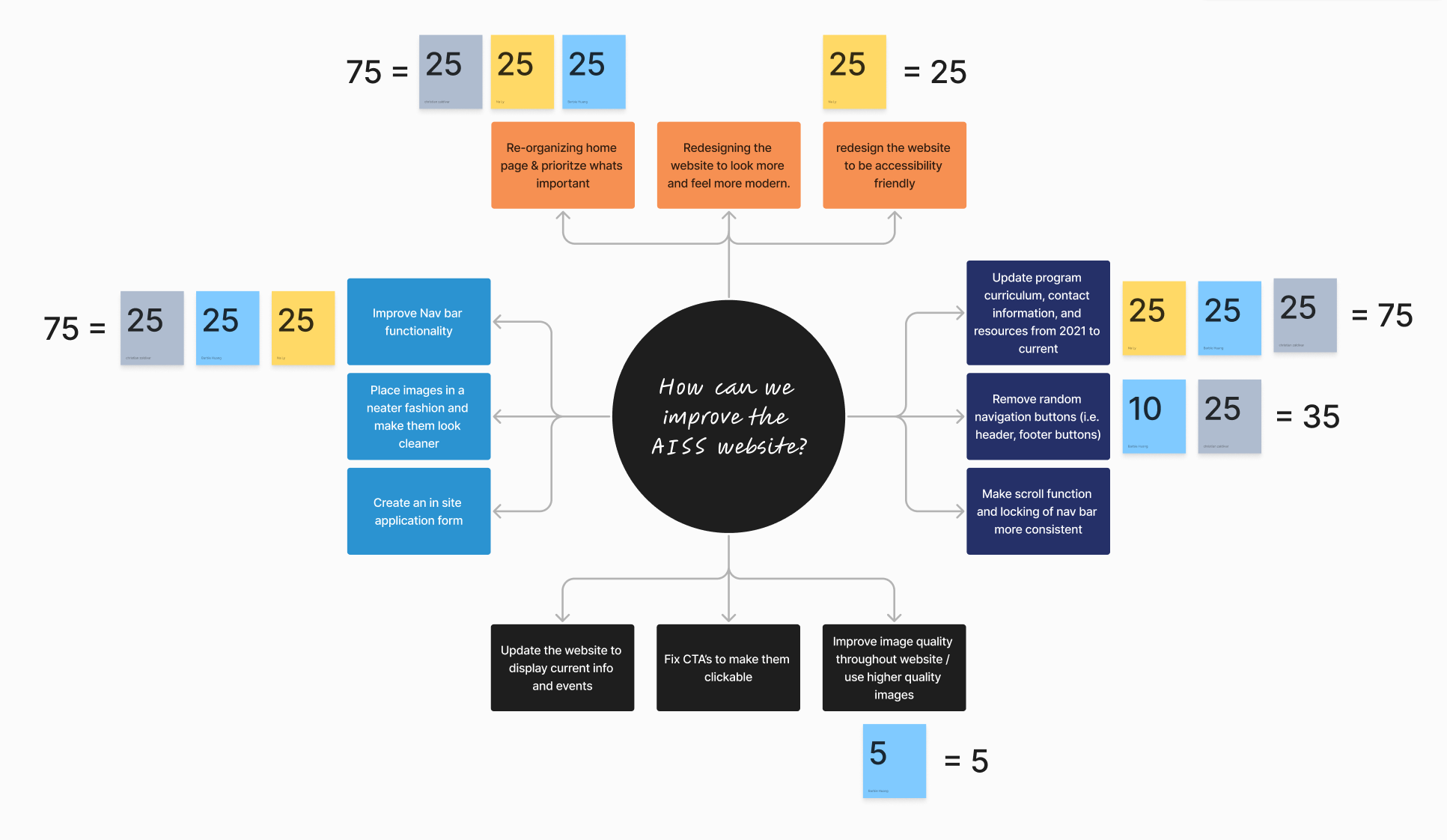
Core Priorities
1 Reorganize the homepage
2 Enhance navigation functionality
3 Update outdated information
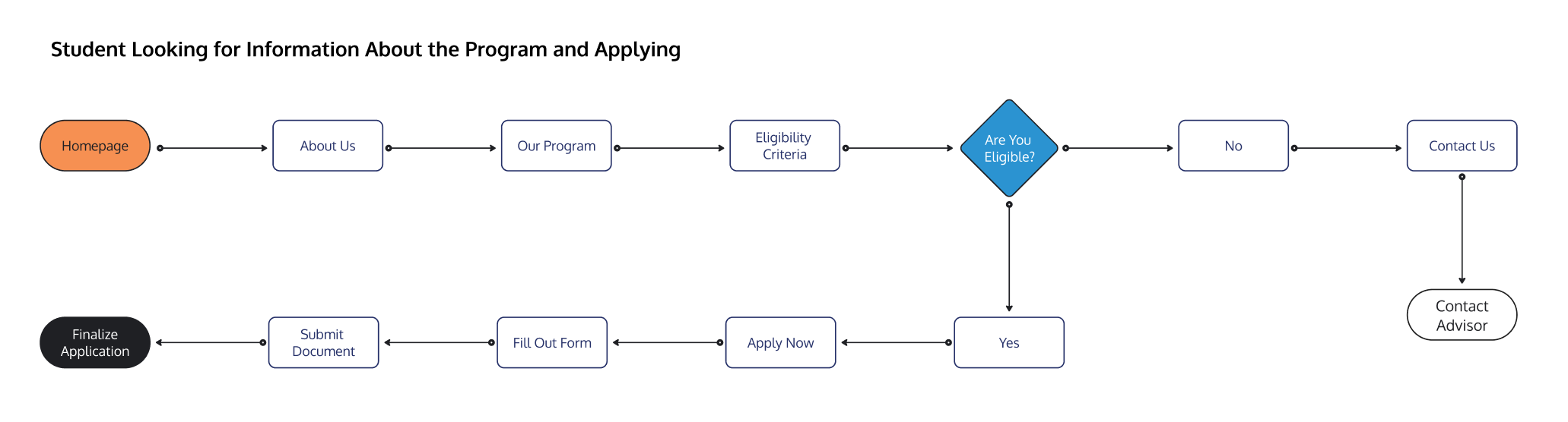
Visualizing the Experience
User Flow
After identifying the core priorities, a user flow was created centered around the experience of a first time visitor. Specifically, we mapped the journey of prospective applicants to the AISS Foundation, ensuring their path to submission would be clear and straightforward.
Tidying things up
Site Mapping
Next we created a site map to ensure users could efficiently traverse the site while maintaining a clear sense of orientation throughout their journey. This resulted in a refined navigation structure consisting of four primary categories complemented by a dedicated donation button in the header.

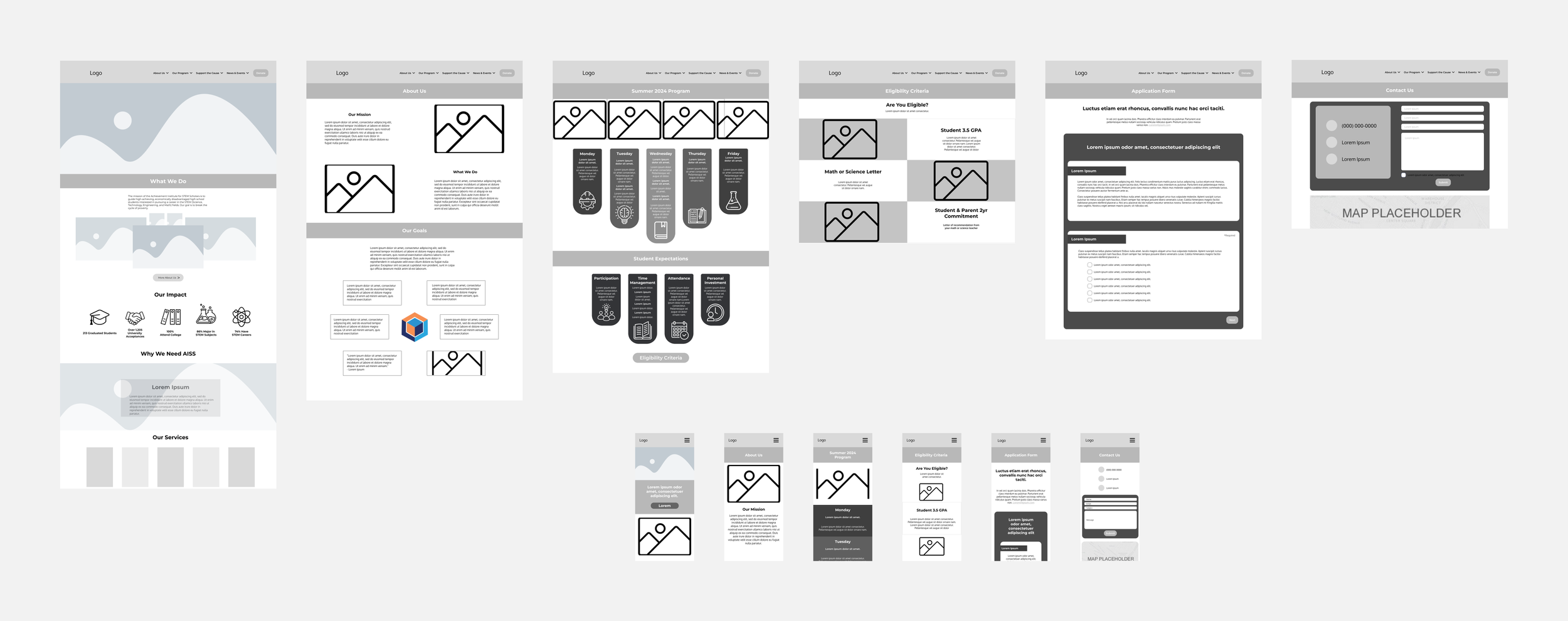
Assembling the Pieces
Mid-Fidelity Design
With the user flow and sitemap established, we moved into the next phase by creating grayscale wireframes for both mobile and desktop.
A/B Testing
Validation Through Comparison
Before moving on to high-fidelity design, we created an A/B testing plan in order to compare the current mobile navigation control to the new variation we created.


Redesigned Navigation
Current Navigation
Feedback
Users preferred the redesigned navigation for multiple reasons, such as:
1 The larger text being easier to read
2 The hamburger menu being fixed in the top right
3 Spacing between the navigation buttons allowed for less error
4 The plus icon being on the right side was more visually appealing
Design in Full Detail
High-Fidelity Design
After testing our wireframes and receiving feedback we created a high fidelity prototype out of our original design.

Revisions & Next Steps
Moving Forward
After redesigning the user flow for prospective students, the next step would be reimagining the site from a donor’s perspective to encourage more contributions and improve overall usability. Another opportunity lies in showcasing alumni success stories, which could both inspire new students and help them connect with peers before starting the program, creating a more welcoming experience.